

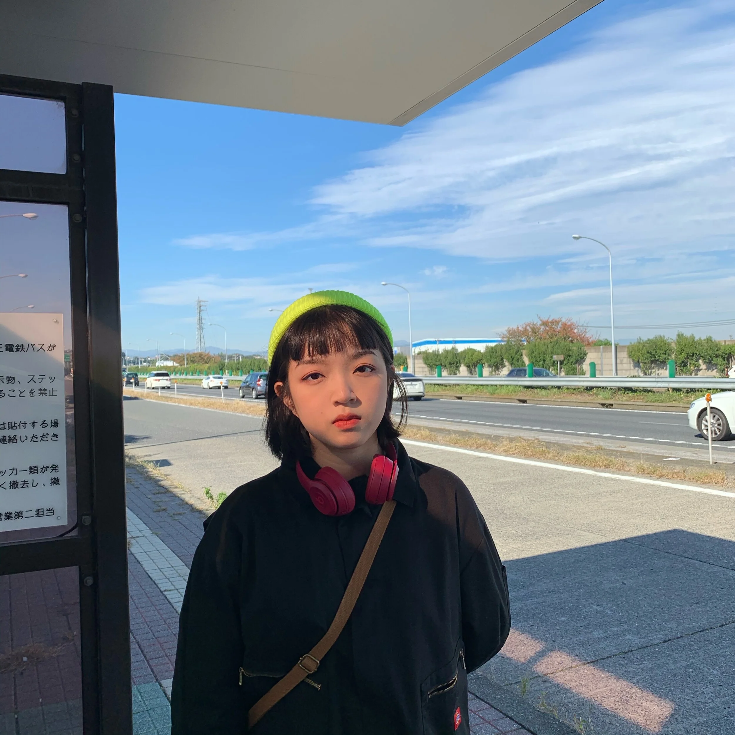
Meet GFF International Talent, Chor Sze Tung from Donghua University, whose final year collection is inspired by parallels between the natural world and the human face: the contours, gradients, and textures that characterise the two. Read on to discover more about her work and plans for the future.
Contact details:
Email: chorjojo@gmail.com
Tell us about you, where are you from, what lead you to fashion and choosing that course?
I am from Hong Kong and study in Donghua University in Shanghai. My parents have taken many intersects classes for me since i was a child, but painting is the only one that has really become my interest and keep learning it. When I was in primary school, I came into contact with the word ‘fashion design’ , which made me very curious about this industry. In this way, I naturally chose visual art as my elective in high school. During this period, I was exposed to the course of fashion design and did my first fashion design work. Although this work has many flaws and great room for improvement, I found my interest and passion in fashion.
The courses in Europe and America are certainly the top of fashion industry, but back to reality, combined with my own family circumstances, I applied for the courses of fashion design in Hong Kong and Shanghai. Finally I chose Fashion Design (Sino-Japan Program) of Donghua University as my BA course. The reason why I chose the Sino-Japan Program was because I still wanted to go out of my country and learn more about the fashion industry of other country and broaden my horizons while my financial situation allowed.

Describe the inspiration and concept behind your work. Talk us through your final project and your research process. How did that come about?
Three-dimensional subjects makes our world full of beauty. I want to create my work about three-dimensional. Base on this, I started to research. I hoped to find something of interest to me. The one that caught my eye was a group of sculptures inspired by human face expressions. They are out of reality, deformed and abstract. However, because of the human face as a carrier, it is full of intimacy and gives a strong visual impact. I started thinking about wearing a costume with creative face pattern. The surface of the earth becomes uneven because of mountains and basins. The rocks become vivid and majestic because of their texture. And human beings are unique because of everyone has identical faces.
I found a picture of a paper cutout that looks like it's three-dimensionally rendered contour topography on a book page. It make the record more than just a record. The record can also be aesthetically pleasing too. In order to record the terrain fluctuations, the scientists simplified the complex three-dimensional relationship into contour topographic maps and created a series of works about mountains. If there is a group of mountains that has grown into looks like us, what will its topographic map look like? With this question in mind, I started the design of this work.

Applying the pattern effects and principles of the topographic map to the human face, my work also retains the irregularities that the three-dimensional world should have. I superimpose each block to form a change in the height of the face. The work is named Cara fría, which means cold facial expression in Spanish. It stands for calm and natural. A calm face, as still as a mountain, remains the same for a long time in our lives.
Tell us about your design process. How do you work? How do you take your research and develop your own designs?
The characteristic of this project is the face and contour, so I made a preliminary analysis of them. Regarding the human face, I tried to disassemble the facial features at first, but I found that these detailed things could not be well expressed through the contour. Finally, I decided to use the two design elements: the front face and the side face into the project. Then, I started by defining the silhouette. I looked for inspiration between the face and the contour. I put the broadside lines of face, the face shape and the curves of a contour map as the silhouette, but I found that such an idea was not satisfactory. I added the other three words: mountain, basin, rock. Mountains give the impression of being hard, expansive, and massive.

I found that the contours to match that feeling is the boxy silhouette and oversize. Exaggerate the width and length, with a wider silhouette at the shoulders and sleeves, and the tops and bottoms are also longer and wider than the base length. There is no gender difference in mountains. I chose trousers that are relatively easy for both parties to accept. Even the skirt-length tops are also paired with loose pants, to create gender-neutral outfits. I extract the color from the mountains.
Initially, I chose the gray and the earthy color, the gradient color is more layered than a single color. However, these two shades not bright enough. So I convert the earth color system to orange. the mask is the focus of the collection, which reduces the impact of the difference in looks between the wearers on the costume, echoing the theme of the pattern design, and the colors are also chosen to complement the costume in blue and green, hoping to achieve the finishing touch.
Tell us about your Collection Development. How do you toile, how do you like to pattern cut, do you like to drape?
This project want to be neutral and oversize style. Thus, the amount of the chest and waist provinces, which emphasize gender and body size, is shifted and the provincial roads are subtracted. The works are altered from the basic style of the garment and sized according to the ideal effect. My course focuses on teaching pattern cut and I am also good at it, so I did pattern cut to realize my collection. The sleeve trim cutouts of the jumpsuit need to fit the natural curve of the sleeves when it is sewn together, so I use draping to define the shape in this section. I did not toile in my works. I finish the pattern by laminating and stitching extra cutouts instead of traditional prints to reflect the three-dimensional effect.

The layering is divided into a laminated overlay for the front face and a stitched overlay for the side face.Frontal face layering is a form of converting the face into a contour topographic map, dividing it into multiple cutouts, cutting it out and then re-pasting it to look like a patterned design. Final stitching or lamination to the body. Side face layering is the process of cutting the side face outline and sewing it to the fabric pieces of the sleeves and pants.
The left and right adjoining seams meet and align. Even if the seams are exposed in a different color from the body, they remain tidy. The seams give the cuttings enough support to allow the decorative cuttings to stand up in their natural state. I use laser cutting to complete the pattern cut of the front and side face, as well as the cut of the mask and the flat pattern cut of the coat, which was cut and glued to the body of the coat.
Talk us through your final collection and each outfit. Why where these the final designs?
The coat set consists side face layering, front face layering and line pattern. The side faces are layered to maintain the overall boxy silhouette, while at the same time creating the internal structure of the A-shape coat and enriching the silhouette of the entire collection. The front face is hidden, as the model's movements keep changing, shows more interesting the inner and outer relationship of layering wear.I also added a laser-cut pattern to adds a sense of design. The jumpsuit consists of a topographic map with decreasing layering, side face layering and rock muscle layering. Decreasing layering is not purely piecing, there is room for movement between the fabric and the trim, creating shadows and adding dimensionality.

The design of the padded vest set is based on the concept of a mountain range of faces in a complete area, using frontal faces layered and topographic map incremental layering. The back color splicing is based on the concept of a decreasing topographic map, decreasing from left to right. The top of Irregular Vest Set's right shoulder shape is inspired by the topographic curve of the mountains, with a conceptual top pattern that gradually appears as a face shape as it reaches the top of the mountains.
The lower half of the dress is designed with a topographic map of diminishing structural relationships that blend into the side face shape. The back top is laser cut with a pure line pattern from the topography of the face, echoing the front face and mask. I think these outfits have a certain wholeness to them in terms of silhouette, but there's a lot of variation in detail, layout, and interior structure. Like the mountains, each one looks so much alike, but composed in a thousand different ways, forming the unique presence of each mountain.

What materials have you used within the collection and how did you source them? Why were this the right material for your collection?
With the theme of "Mountain", the overall feeling of thickness and heaviness is desired. I also used heavy wool in my fabric selection, including polyester felt, tweed, and suit wool, a combination of similarly textured fabrics, hoping for a stronger overall look. I chose polyester felt for two reasons. First of all, it is thicker and stiffer, which keeps the cut piece upright during the creation of side face layering and rocky texture layering, while it is less prone to wrinkling and can maintain a neat effect. In addition, the felt comes in a variety of thicknesses. Different thickness and hardness of felt can be matched according to the desired effect and process.
For example, the front face layering and topographic map layering need to use a certain thickness of fabric to highlight the three-dimensional effect. After the trade-off between hardness and thickness, finally I chose the thickness of 2mm felt. For the layered part of the rock texture, a softer 1mm thick felt was chosen because of the need for natural irregularity, and each piece had a natural curvature. The color and material of this project is very important, most of the materials are hand-picked at the fabric market, a few materials through online shopping to get sample confirmation before placing an order.

Tell us about your illustration technics. Explain your final line up and what art materials and technics you use to showcase it.
My works focuses on colour and silhouette, and I need to emphasise the three-dimensional layers by using gradient colours of different brightness. So expressing the proportion of colours and the proportion of the silhouette became the importance of the illustration. Using a computerised hand drawing board, I am free to draw the desired outline and change the appropriate colour at any time. I also chose the human body proportions similar to those of real models as the basis, so that when drawing the design, I can consider the color distribution ratio and the clothing length and width ratio clearly and draw a clear picture, which can be seen at a glance during plate making and production, greatly reducing the number of changes.

What part of your final project have you enjoyed most and why? ie, the research and concept or maybe the manufacturing of the collection.
I enjoy the collection development the most. My design was created by layering one decorative cutout piece over the bodice before the effect came out.Since it needs to be intensive in order to be effective, the "production" is a very important part of determining whether the design will be ideally presented. The making process takes a lot of time and effort, the felts are hard and the large amount of felts makes them harder and heavier, making the sewing process very difficult.But, overcoming everything, when these embellishments are complete, even if it's just a single cutout, not a complete costume, the effect is ideal, and the sense of accomplishment of making it myself is very memorable.
What’s an aspect of the fashion industry that you’re passionate about fixing or having a positive impact on?
I am passionate about fashion design and I think the most important thing about costume design is originality. Every design is the work of a designer, and plagiarism is absolutely undesirable. So I would never do anything like that either.

What is your plan once you finish your BA? Where do you wish to be in the future?
After my BA, I plan to go into the fashion industry and work in the direction of fashion design. While I won't necessarily be a well-known designer, I'll do my best to create the right clothes for the brands I work for.